Hello out there...anyone there? As usual, I must open up the post with an apology! I have been absent for way too long. Although I will say, it was self imposed and much needed!
I have worked really hard over the last year to build up the business and low an behold it work it! Maybe a bit too much! I was so burnt out by the end of June I had a hard time focusing on anything...let alone my business! I working in the shop only because I had to and refused to create (probably because I couldn't - there simply was nothing left in the tank)!
Well, this past week, I have been motoring along have really done some wonderful pages and projects. Today I will focus on one that took me a few days (due to drying times) and share with you the results.
This spread was inspired by Gayle Price (a design team member over at Mixed Media Place and Creative Team Member over at Finnabair).
Here is Gayle's piece that caught my eye:

Now, I don't know about you, but most of my spreads are definitely inspired by something or someone, sometimes they look similar and other time you shake your head and say "o - kaaay?"
Here goes mine:
Let me start off by saying I find it very similar, but this is my finished spread mainly because there is so much texture and the idea of putting some collage on it doesn't sit will with me (the texture is totally my own fault)! I may try doing a stamped image or image printed on tissue paper at a later date.
Here is my process and the hidden experiment!
I started out by attaching a cut up Newprint Bag from the shop to fit the page. Added some older 7 Gypsies Paper Tape in a pattern that appealed to me. I used Golden Fluid Matte Medium to adhere it all down.
Next I applied a wash of White Gesso.
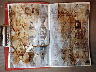
Now comes the experiment! I thought I would do one side of the spread using Liquitex Light Modeling Paste. The stencil is (Prima) Finnabair Elementals Harlequin.
And the other using Golden's Coarse Molding Paste!
Can you see the difference? I can not only see it, but you can actually feel it too!
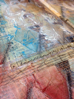
Here are a couple close ups....
This is the coarse one...can you see the tooth?
Once the first layer was totally dried, I laid over a second stencil - (Prima) Finnabair Elementals Alpha. I continued using the same pastes on each side as I did in first application. You really can see the difference can't you!
Now it is time for some sprays! I decided to use Lindy's Stamp Gang Moon Shadow Mist Mystic Malachite, then topped it with Starburst California Poppy Gold and Mission Bells Brown (these color are from a variety of Little Lindy's). I used my water bottle along with each color for dilution and or movement. I also tried to dry with my heat tool between each application of color so that they would not become too muted.
Can yo see how the colors have reacted to the two different pastes? So far I have noticed that the Liquitex is more to my liking for the sprays in this format as I am able to manipulate them more. The Golden, seems to absorb the color more and therefore making it appear more 'bright' and true in color.
Was thinking it might be a tad to dark, so added some Heidi Swapp Color Shine in White to tone it down and now I really like it.
Now, once again time for yet another layer. This time some more washi & paper tape and stamps.
This stamp is from an older Wecndy Vecchi set I have and of course the ink colors of choice are Wendy Vecchi's Archival Inks in Tree Branch and Potting Soil.
This stamp is a Tim Holtz one (think it was the reverse script image one) and again, used Wendy Vecchi's Archival Ink in Potting Soil.
Once I allowed it to dry(ish), I started with Faber Castell's Gelatos in Coconut, then moved onto Cotton Candy and finally Cinnamon. I blended along the way with my finger using just it, or the addition of some water via the spray bottle or dabbing my finger on a baby wipe. As some points, I actually used the baby wipe to tone down the colors as I felt they were too bright. I then finished it off by shading with my Black Stabilo All Pencil on the bottom right of each diamond (blended with my finger).
again, there is a real difference with the two pastes while using Gelatos. The same rules apply. I was able to blend easily on the Liquitex side (left) and the Golden side, I really had to use more pressure and a lot more water. You can really see it in the above photo in the white. There is a lot of Gelato there that needed to be blended.
Thinking there really should be something else on it - like a collage piece, but at this point I am simply going to turn the page. One never knows, I will probably end up back at it one day!
Final thoughts....
Liquitex Light Modeling Paste - smoother texture; blends colors easily; colors do not stay as true
Golden Coarse Molding Paste - very rough (coarse) texture; holds the color more, does not blend as easily; colors absorb more and true.
I will try this format again, but will try it using a different color format...perhaps acrylic paints.
Thanks for bearing with me over the summer. I will do my best to post more often. I do have several projects to post over the next week, so be sure to some back and check them out.
Loads of new product is arriving almost weekly now as all the new summer releases are being shipped from the manufacturers so be sure to head over the the shop to see all the goodies!
Have a great day....stay creative!


No comments:
Post a Comment